In this article I’m going to describe the process of designing a main menu for a game. While the look may be very different from game to take, the approach I use is similar and usuable across genres.
Don’t over do the designs. Simple, is most of the time also the most effective and best solution (In my opinion).
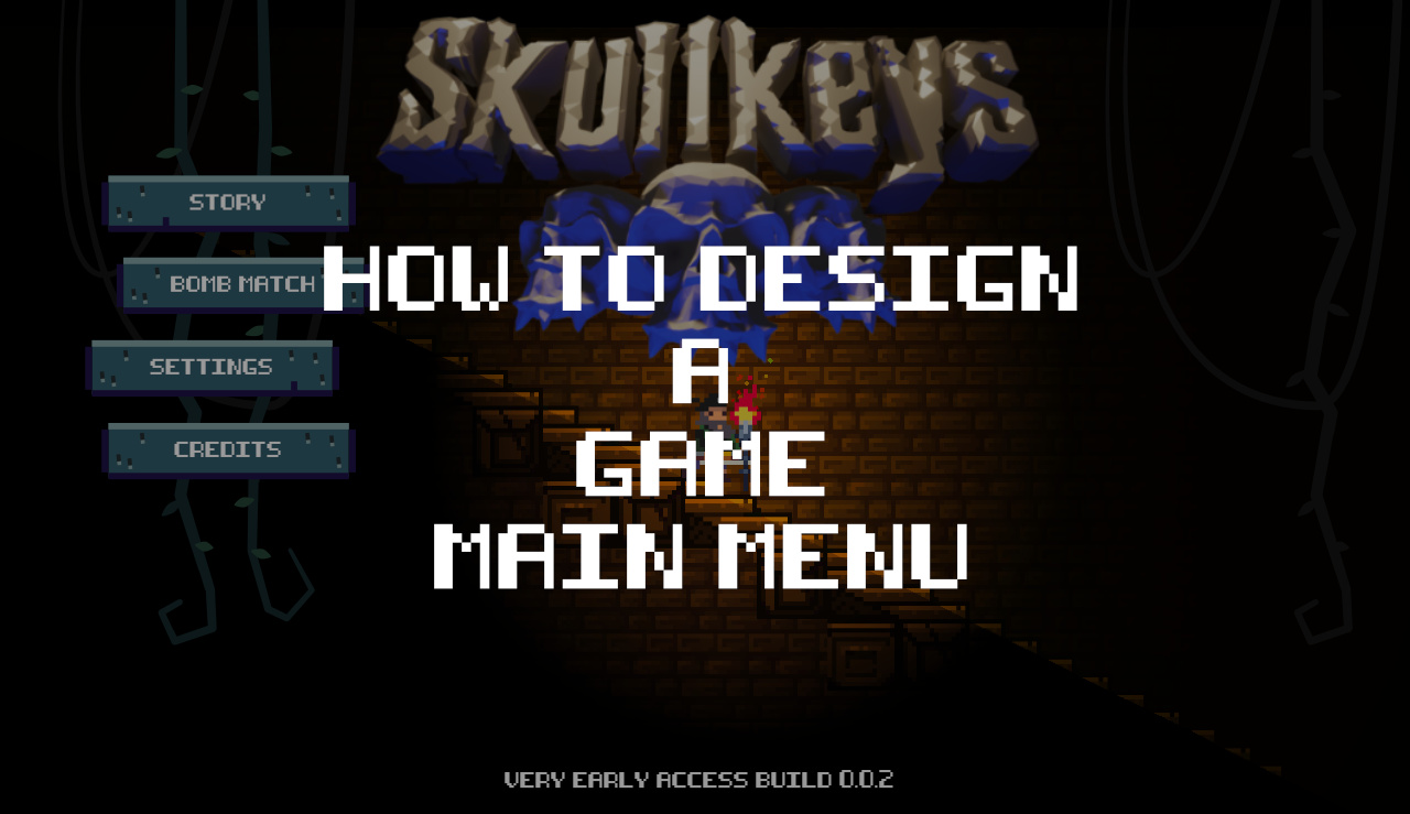
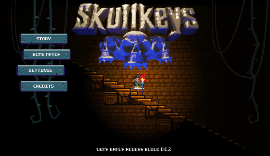
How to design a game main menu
Firstly, I always try to follow the general design mood of the game.
Skullkeys is a game about dungeons, secrets, skeletons…whips. 😉 We have already established a logo with a some colors. Luckly we also already have a few characters, tilemap designs to draw inspiration from.
Color scheme for our main menu
Let’s work with a simple color scheme or greyish blue to a more purple blue in the shadows. The game is also quite retro pixelated, so let’s also make sure we keep the pixel aspect. As always, this is by no means any rules. But rather a design choice to get a chohesive design in our game, menus, buttons and overall impression.
Main menu options for our game Skullkeys
The selectable buttons we need for the main menu (for now) are:
- Story (Main game play mode)
- Bomb match (multiplayer game)
- Settings
- Credits
The main menu button design
So a few simple square buttons close to our color scheme, I “break apart” the buttons slightly with some pixel engravings / carvings in the button-plate. It fits the theme and gives the buttons a more orgranic touch! I also made the shadow slightly more saturated on the buttons and more towards blue for that dramatic effect. Subtle but effective. 🥳
Make your menu part of the “game world”
I remember playing Dead Space for the first time. The character health meter was on the actual character in the game, tightly integrated with the visuals. No distractions. A beautiful execution of great UI/UX. 🤩
Somehow we need to tie the buttons to the image so they just don’t float in the air. Therefore I added some vines behind, I weighted the image by adding a few more “darker” vines at the right side. Balance is always important. And I also wanted to give the screen a sense of depth.
Animating the main menu of the game
This design can also be animated, so the vines can carry the menu buttons down into the screen when it’s displayed. We could replace the vines with chains too if we wanted another more shiny design. Yes, I know it’s not revolutionary, but it works! 💀
Final words
So that’s how to design a game main menu!
Now, if this is our final version that actually makes it to the final version of the game… Who knows!? But it’s always a start.
And that’s how we work with creative decisions. We begin with something. And maybe it’s good enough…or we go back and refine. But now we have a very good solid start.
Let us know if you like these posts!